B2B SaaS
2026
5min to <1min: Democratising Logistics Data for Non-Technical Teams
The app suffered from raw database that forced users to scan thousands of technical rows to find a single vehicle. This complexity locked out field teams, making them dependent on IT to answer: "Where is my cargo?"
I led the UX audit and redesign of the Tracking App, pivoting the product from "row management" to "mission monitoring." By abstracting complex data structures to pass the "Grandma Test," I empowered non-technical users to triage assets instantly—reducing asset location time from five minutes to under ten seconds.
Problem area
UX Problem: Stakeholder Rejection & the "Grandma Test"
A stakeholder audit revealed the legacy UI was operationally unusable, leading the Director of Units to reject it for its lack of clarity. This failure defined our mandate: the "Grandma Test", transforming a complex database view into an interface where non-technical users can monitor assets and verify arrivals instantly.
Design decision 01
Domain Separation (Viewer vs. Operation)
To solve the "Excel Effect," I decoupled the live operations from data administration. I moved technical tables to a dedicated "Management View" and introduced "Live Trips," prioritizing instant situational awareness for commanders while preserving raw data access for IT staff.
01
The "Live" View
I created a dedicated "Live Trips" interface where users monitor active trips and statuses, allowing them to click into specific trips for details.
02
The "Macro" View
I introduced a High-Level Dashboard to provide immediate insight into fleet health; for viewer to get a brief understanding of any critical situations.
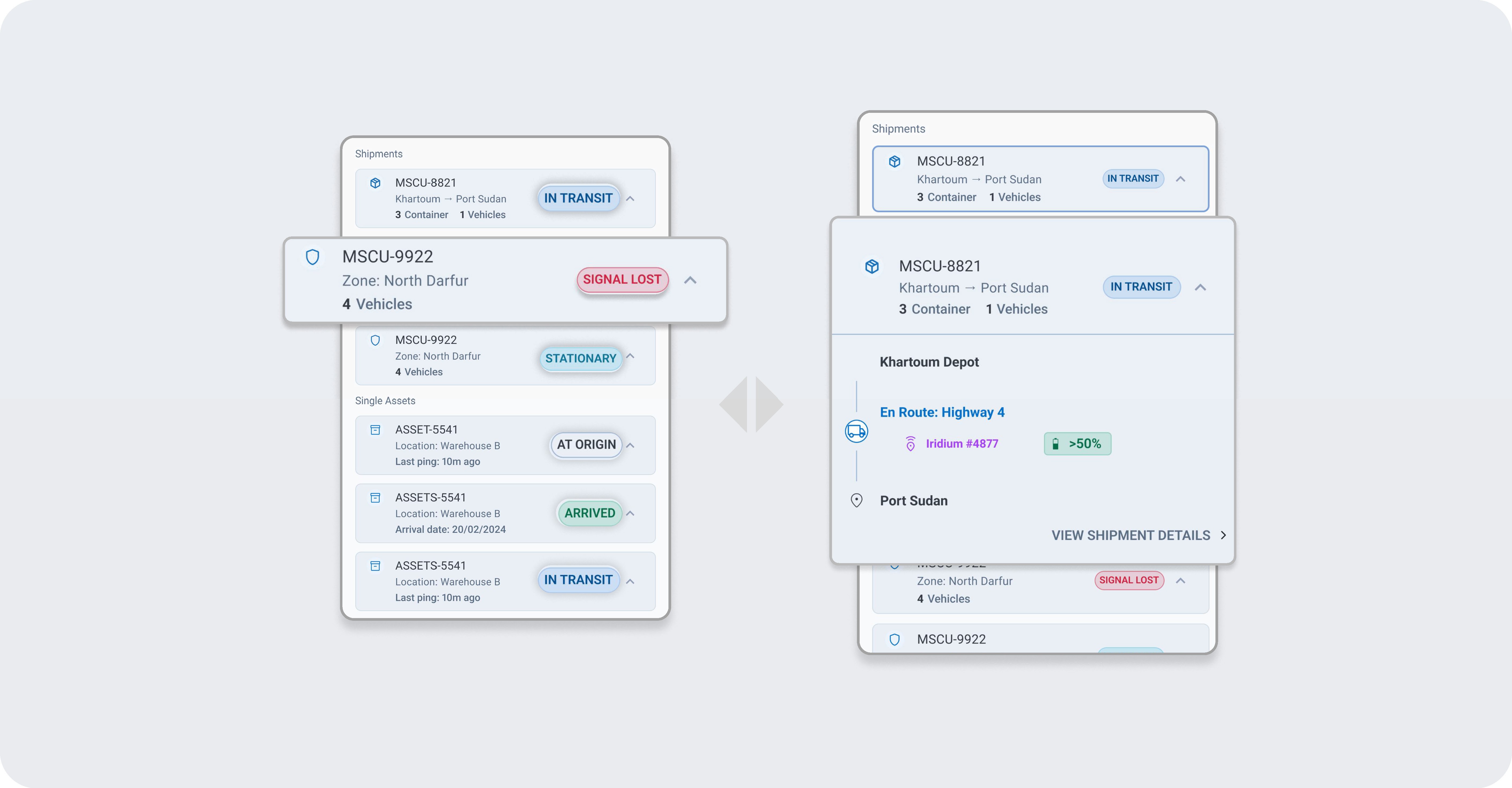
Before & After: From static tables to live trips accordions
The "Macro" view Dashboard

Design decision 02
Operational Intelligence (Solving Alert Blindness)
To fix the "False No Location" crisis, I replaced generic red error codes with Human-Readable Statuses. I implemented a strict semantic system.
IN TRANSIT
(Blue): Informative, live updates.
AT ORIGIN
(Grey): Neutral, no action required.
STATIONARY
Safe but not moving.
ARRIVED
(Green): Mission complete.
SIGNAL LOST
(Red): Critical risk, immediate action required.
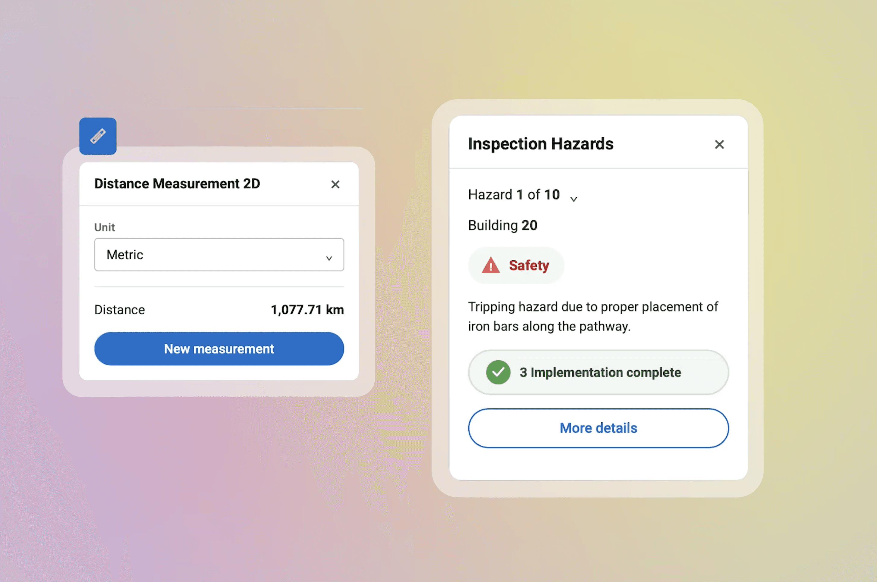
Confirmation screen
Design Strategy
Bypassing Low-Fidelity with AI
To overcome stakeholder hesitation, I bypassed traditional low-fidelity wireframes. Instead, I used a "Vibe Coding" workflow treating natural language as a design tool to rapidly generate and validate high-fidelity prototypes. This allowed stakeholders to react to the actual "Grandma-Friendly" experience in real-time, cutting weeks of abstract debate.
Retrospective